Just a few months ago, WordPress introduced the sitewide editor in 5.9, but 6.0 is right around the corner. It is currently on schedule to release on May 24th, 2022, and will expand site editing functionality among other improvements.
The main focus of this update is on the customization available to users. More options will be added to the site editor, blocks, and page design (via Patterns). As a result, users will have more freedom in content creation than ever before.
And if you are interested in taking a look at what’s new, you can use the WordPress Beta Tester Plugin to test out the beta. Like all version updates for WordPress, there is a lot of performance and quality-of-life updates to be excited for.
Let’s take a deep dive into the beta and see what new feature you should be excited about.
What’s New In WordPress 6.0?
Just about every section of WordPress has new changes, but some are bigger than others. For this reason, I will try to stick to the major changes. I strongly encourage everyone to use the beta to explore what’s different about the tools you normally use.
Let’s start with the changes to the site editor.
Site Editor
Front and center are the site editor changes. The team focused on removing limitations to the system. These include:
Switching themes will no longer impact template settings. That’s right, you can keep all template settings when switching themes!Once you customize your theme’s template and style settings, you can now export them to use on another site. It’s a terrific tool for those that manage multiple websites. This is only available for block themes, though.
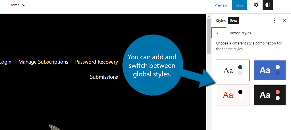
Template customization has been expanded. You can now find options for taxonomy, author, and category.You can now add and switch between global styles. This allows users to add styles while not impacting the one they are currently using. It will be very useful for changing your website during seasonal events.
These are just some of the changes you can experience in the beta. Some expected changes also include a new cursor mode, Browse Mode. This will allow users to navigate through the site within the editor itself.
However, I wouldn’t expect it at release as it is still not available in the beta. But it will certainly be available by WordPress 6.1.
Changes to Blocks In WordPress 6.0
The block editor is getting a lot of changes in this update. Previously when users selected text in different blocks, the end result would be both blocks being selected. However, that’s not the case in WordPress 6.0, you can now just select the text you want like so:
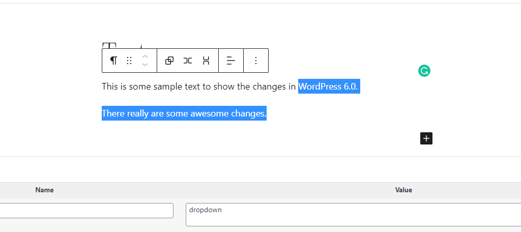
This is significant for a variety of reasons. One such is the fact that you can now use keyboard shortcuts to alter the text like CTRL+B to make it Bold.
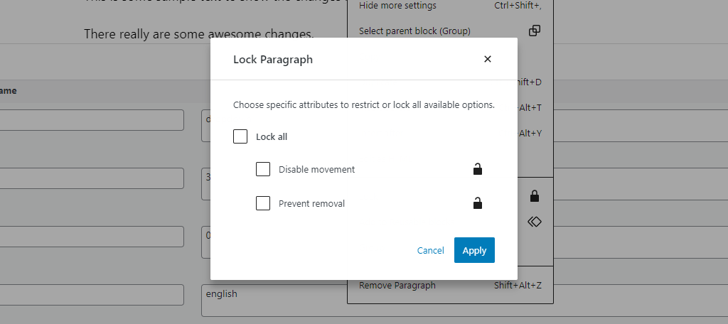
Another significant change to Gutenberg is the ability to lock blocks. While it was introduced in WordPress 5.9, 6.0 is making it more accessible. You can now find the option when you expand the block settings like so:
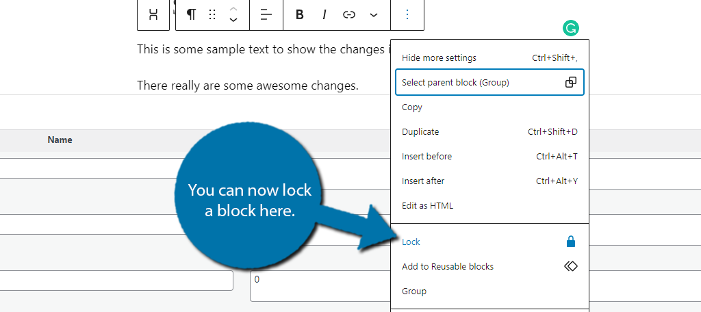
Doing so will pull up a small dialogue box. Here, you can select to lock everything about the block, only disable movement, or only prevent removal.
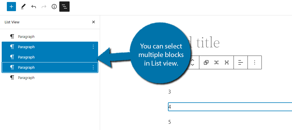
You can now move multiple blocks in List view! To do this, select list view and click on a block. Then use Shift+Click to select additional blocks. It’s a bit hidden, but it is a really useful feature for moving multiple blocks around a post or page.
These are just a few of the major changes. There are more than a dozen minor changes made to various blocks and other elements within Gutenberg.
Of course, it’s not just the tweaks to the editor that users can expect. There are also a variety of many new blocks to choose from. An emphasis on design is front and center in these new blocks. And it can all be done within Gutenberg.
A few of the new blocks include:
Comments Querry Loop
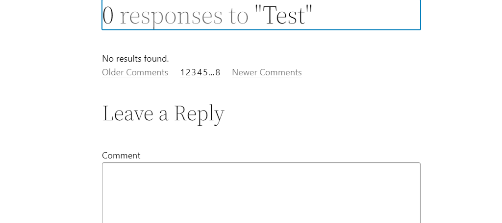
This block allows the user to display comments within a post or page with a variety of visual customizations available. It even allows users to switch between specific comment pages.
It’s a great way to highlight the comment section.
More importantly, you can place it in a different location than at the bottom of the page. Just remember to actually remove the comment section at the bottom or it may seem redundant.
If you have no comments, you will see a “No results found” message.
Read More
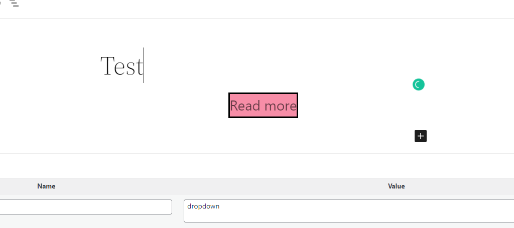
While we currently have an Excerpt and More block, the Read More block is a superior version because it gives you a larger amount of customization. This makes the Read More button stand out more to help improve the clickthrough rate.
You can find options to customize the typography, background color, and border options among other things. And yes, you can add your own Custom CSS to this block and all of the new ones.
It’s a big step up.
Avatar & Post Author Biography
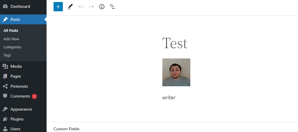
While the Avatar and Post Author Biography blocks are separate, it’s worth talking about them together because that is how most users will use them.
The Avatar block allows you to add the current user’s avatar to a post or page. Whereas, the Post Author Biography block adds that user’s biography to the post or page.
As you can see, they go together very well. Each has a variety of customization options available, so you can make them as flashy as necessary.
If you currently use a plugin to display this information, you may no longer need it when the patch goes live.
More Customization Than Ever
While I have already mentioned that there are a ton of new customization options for existing blocks, it’s true for the entire platform.
Without a doubt, some of the most significant additions are the Row and Stack blocks. These are accessible when selecting multiple blocks and allow you to group blocks together in a specific manner.
In the case of a Row block, you can put multiple blocks as part of a single row, whereas the Stack blocks put them into a column. It’s a really effective way to customize the appearance of your posts and pages.
Many users were upset that the Webfonts API didn’t make it into the 5.9 updates, but it certainly made it into 6.0.
This gives both content and theme developers access to include web fonts as part of the global settings. The reason that this update took so long was that the developers wanted WordPress to deliver excellent performance when using web fonts.
That just wasn’t possible before this framework update. Now, you can enjoy a wider selection of fonts without sacrificing speed.
Another notable enhancement that many websites will be able to take advantage of is the updated Gallery block. You can now customize the spacing between images. This will give you more control over your gallery layouts.
And again, this is really just scratching the surface of what 6.0 is bringing in regards to WordPress customization features.
Page Patterns Are Here
One of the most interesting additions in WordPress 6.0 is Page Patterns.
By default, when a user starts a new page, it is a blank canvas that they need to fill with blocks. And while this gives users complete freedom over what they are creating, it also provides no help when starting out.
When you consider that many pages tend to use a similar design, it can be very annoying. Some may even consider it a shortcoming.
Page Patterns fixes this because you can now select a pattern for a specific page type that you want to create.
For example, you could add a pattern that will be perfect for a Contact Us page. The blocks necessary to achieve it will be added and formatted, all you need to do is fill them in.
At their core, Patterns are very similar to page templates, and they will appear whenever you create a new page. However, none of them are natively available in WordPress. This means you need to manually code them in, which is slightly annoying.
However, that won’t actually be necessary.
To help this new feature expand, developers have introduced a Pattern Directory on the main website. This allows users to upload and download patterns that they can use.
Without a doubt, this will change the landscape of creating pages in WordPress.
Eventually, I believe that picking out Patterns will have the same level of importance as picking out a theme or a plugin.
That said, I am willing to bet this feature will see a lot of love from the plugin community when it is in the wild. I’m confident that there will be a variety of plugins that can put this feature to good use.
Cleaner Code For Images Is Here
Code involving images is about to get a lot cleaner because you will no longer have to place the DIV tag around images. While this is most notable for images, it’s also worth highlighting that any block that had alignment options were also wrapped in a DIV tag.
Thus, the code will be significantly cleaner in WordPress 6.0, which can help prevent slow load times.
Just be aware that this change will only apply to themes that support the new theme.json file. Another noteworthy change that is somewhat related is a change to the ALT text in featured images.
If you forget to add ALT text to a featured image, WordPress will now use the post title as the ALT text. This is intended to help improve a site’s SEO.
And speaking of featured images, you will now be able to select them for use in the Cover block. It’s a really nice change.
Phase 2 Of The Gutenberg Project Is Just Beginning
For those that are familiar with the WordPress roadmap, we are well into Phase 2 of the plan. As a refresher, here are the four stages of Gutenberg:
Easier Editing: The introduction of the Gutenberg editor to help make editing posts, pages, and widgets easier.Customization: Improvements to the customization features available when creating content for posts and pages.Collaboration: These updates will focus on making the platform a better option for collaborations and multi-site management.Multilingual: To ensure the platform is accessible throughout the world, more language options will be available natively.
With that said, Phase 2 is still far from over and you can still expect new features and improvements in regard to customization potential. The real goal of Phase 2 is to ensure that users don’t feel like they need to use a Page builder plugin.
With Patterns here, that is definitely becoming a reality. Although it will still take more time before the base WordPress tools become comparable to a page builder, that just means we have more to look forward to.
Once that is achieved, we will certainly begin seeing a shift in priorities away from customization and more focus on collaboration tools.
This is very exciting as you typically need to rely on bulky plugins to use WordPress effectively as a collaboration platform. WordPress is continuing to innovate, and there are still a lot of exciting updates on the way.
WordPress 6.0 Is The Massive Update We’ve Been Waiting For
The WordPress platform has been constantly updating its feature selection, but they have definitely been smaller updates.
But WordPress 6.0 is different. It’s a massive update that adds so much to the platform in terms of performance, customization, and accessibility.
And that’s a big reason why the platform is so popular. Developers are constantly innovating its systems to ensure that users have the most options available while ensuring that they are easily accessible. There’s something for everyone in this update.
Remember, you can check it out early by installing the WordPress Beta Tester Plugin on your website.
What features are you most excited about in WordPress 6.0? How integral do you think WordPress Patterns will become when designing pages?

